Expressive Typography
For this assignment, I originally picked a scene from the show Flight of the Conchords. As funny as I think that show is, I realized that there really wasn’t enough expression going on in the scene for the assignment to really sparkle. So, after the untimely death of Catherine O’Hara, I remembered how much I loved that show and sought out some of the best scenes the internet had to offer. I was torn, but eventually landed on the episode titled Proof Positive. (scroll to 6:23 https://www.youtube.com/watch?v=VeBwlywDPX0)
The scene opens with Johnny and David:
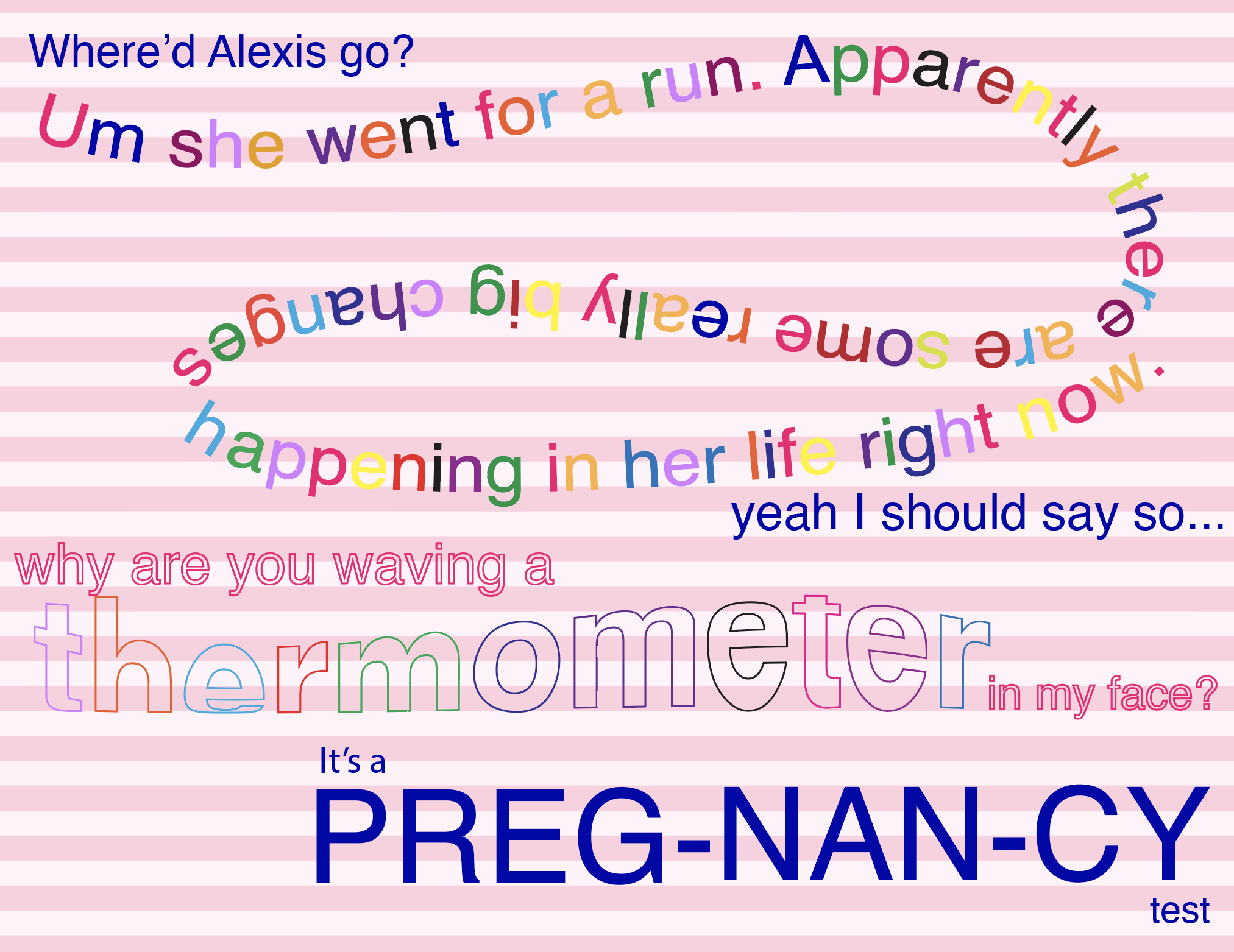
J: Where’d Alexis go?
D: Um, she went for a run. Apparently, there are some really big changes happening in her life right now
J: Yeah, I should say so
D: Why are you waving a thermometer in my face?
J: It’s a pregnancy test
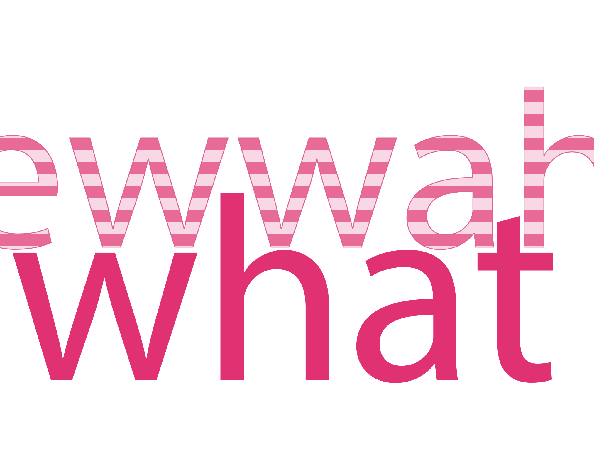
D: Ewwwah, what?!
I chose to give each character a different color font. Johnny has a strong, solid, conservative, calm navy-blue color. David makes me think of hot pink because of how playfully sassy his character is, and Moira, I gave the color red for her explosive, emotional, and dramatic responses to everything. However, for David, the cadence of his speech felt deserving of more chaos and spontaneity, so I chose to make some of his lines many colors, like the circus he is. I made David’s question transparent because he sometimes just doesn’t understand basic things. Additionally, I played around with different effects on the word “thermometer” to literally make it wave. I chose to hyphenate the word pregnancy because of how Johnny articulated it to David. The scene here ends with David saying “Ew, what?!” and I thought that, with how punchy he said that line, I would give it its own slide.
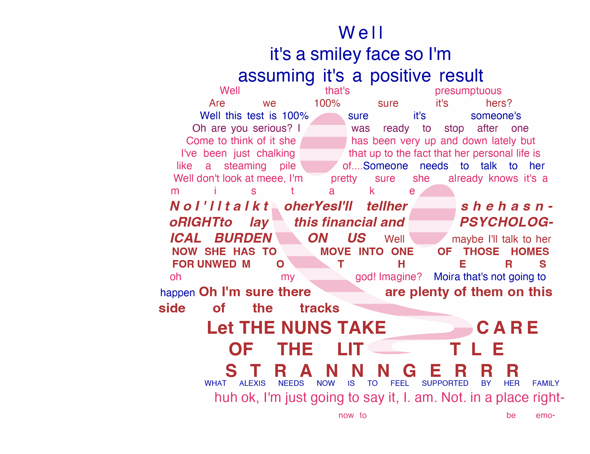
I chose to try my hand at having text fill a shape, and what better than the melting smiley face emoji to convey the scene’s tone. The characters kept their respective colors, and everyone used the same font style, aside from Moira, whose font I changed to bold, and many of the words she says as she spirals out of control are spelled as they sound and capitalized. There are some differences in the size of the font for each character, and that was my attempt at filling the space, as a larger font would leave a lot of white space, making the shape indistinguishable. I also placed the image just a little off center because what makes the Roses so entertaining is that they are just a little…off.
Moving on, we end the scene with everyone arguing.
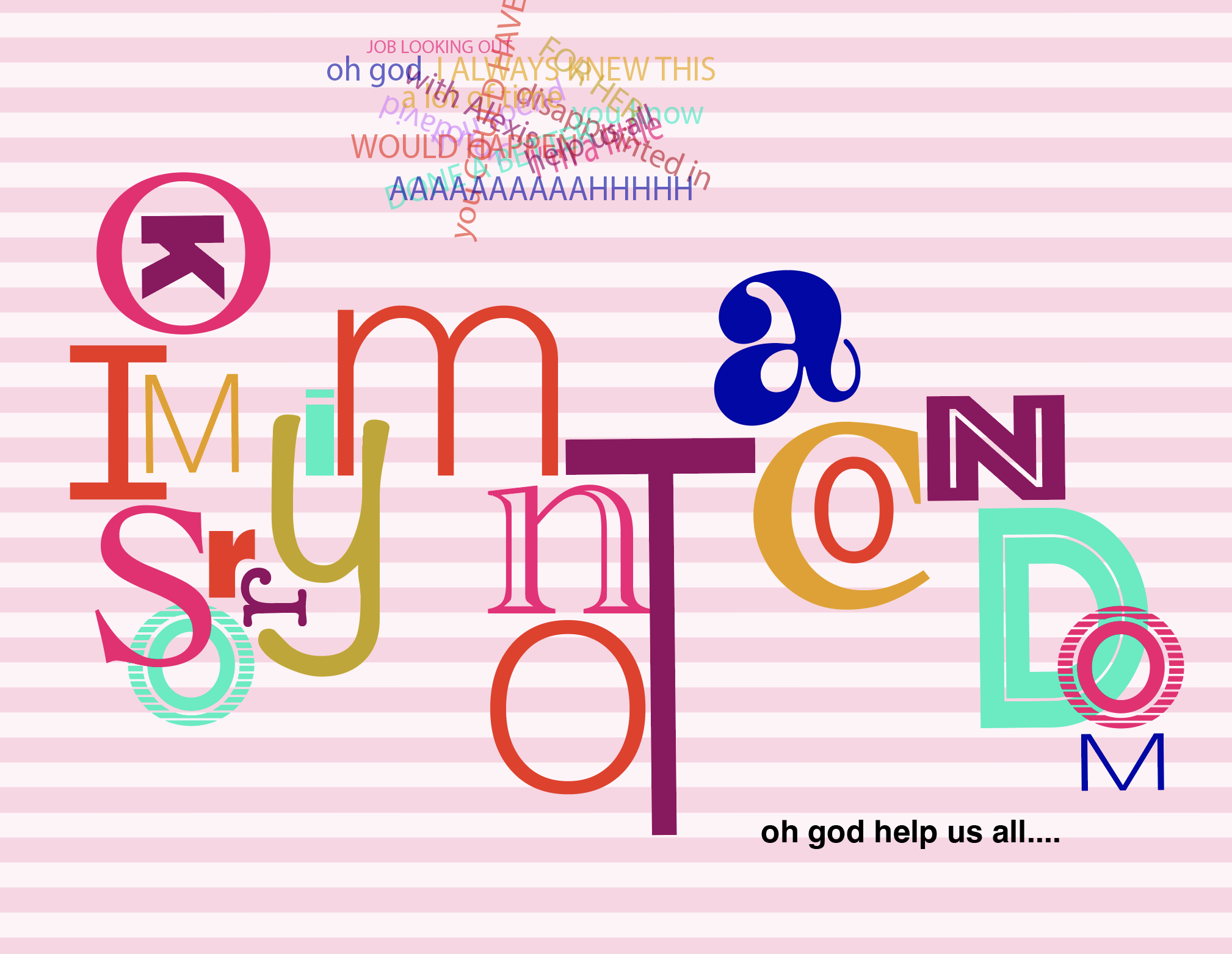
J: You know I’m a little disappointed in you, David. You spend a lot of time with Alexis, you COULD HAVE DONE A BETTER JOB LOOKING OUT FOR HER
D: Ok, I’m. sorry. I’m. not. A. condom.
M: (Screams) I always knew this would happen! Oh god help us all…..
There are so many funny moments in the minute and a half that we are watching, but my favorite part was when David says, “Ok, I’m sorry I’m not a condom.” …Because what did Johnny really think David could do to prevent this???
There’s a lot going on here. This was the first time I was exploring Illustrator, and through my pins on my typography Pinterest board, I was drawn to this typographic layout and had confidence that I could likely imitate it. I first created a new layer for each letter. I’m still not sure if that’s really necessary, but I find it easier to manipulate each letter just so. I proceeded to try out different fonts and colors. This combination of colors is specific to my style.
I cannot get away from them.
No matter how hard I try to stay within a certain color palette, every time I use color, I use all of these colors. Lol.
The N, O, and T are symbolic of Alexis and Mutt in bed together, and the A, slightly tilted towards them, represents David as the chaperone, essentially ‘doing a better job looking out for her.’
Some feedback I received on the draft was that the word “condom” was difficult to follow, so I changed the font and the direction of the flow to make it easier to read. I followed that up with Moira’s ‘oh god help us all.’ I made that smaller because she whispers it and kept her line, her signature red.
Above the main quote, I typed up all the lines from this part of the scene and set them to different colors to convey the chaotic feeling of the argument. Additionally, I needed a design element that would bring all the artboards together, making it feel like one cohesive project. I am a sucker for a stripe and thought that stripes conveyed a message of ‘having your life in order’ which is somewhat comical given that their lives—as they see it—are in shambles. The baby pink color was intentional, given the scene’s topic. I also think that the stripes help to balance out the chaos that is happening on most of the boards due to the heavy lifting my curiosity was doing, learning how to use Illustrator, and trying out new concepts.
