Data Visualization
The next assignment was dabbling in a little data visualization. After much searching for an interesting sex-related dataset, as one does, I settled on the International Study on Male Genital Measurements Dataset. Most of the data that I had been sifting through was of very serious topics, such as the sexual abuse of women and children. And while there is certainly a time and place for this work, I decided to drill down on a lighter topic.
This study examines body measurements from men across 139 different countries, involving over 96,000 people. The data are grouped into 12 main regions to see how sizes change and how much they ‘grow’ from one state to another. Beyond the raw numbers, the data reveals something very human: a big difference between measurements taken by doctors in a clinic and what people report about themselves when they self-report. As we walk through the charts, we’re going to look past the usual myths and find out what the real global averages are, and which regions have the most surprising changes.
The first chart is a bar chart detailing the average length by region. I thought that adding in the subtitle where North American penis owners stood would be interesting to my audience. But it wasn’t until I started looking into the differences between flaccid and erect lengths that I found some interesting information about South America.
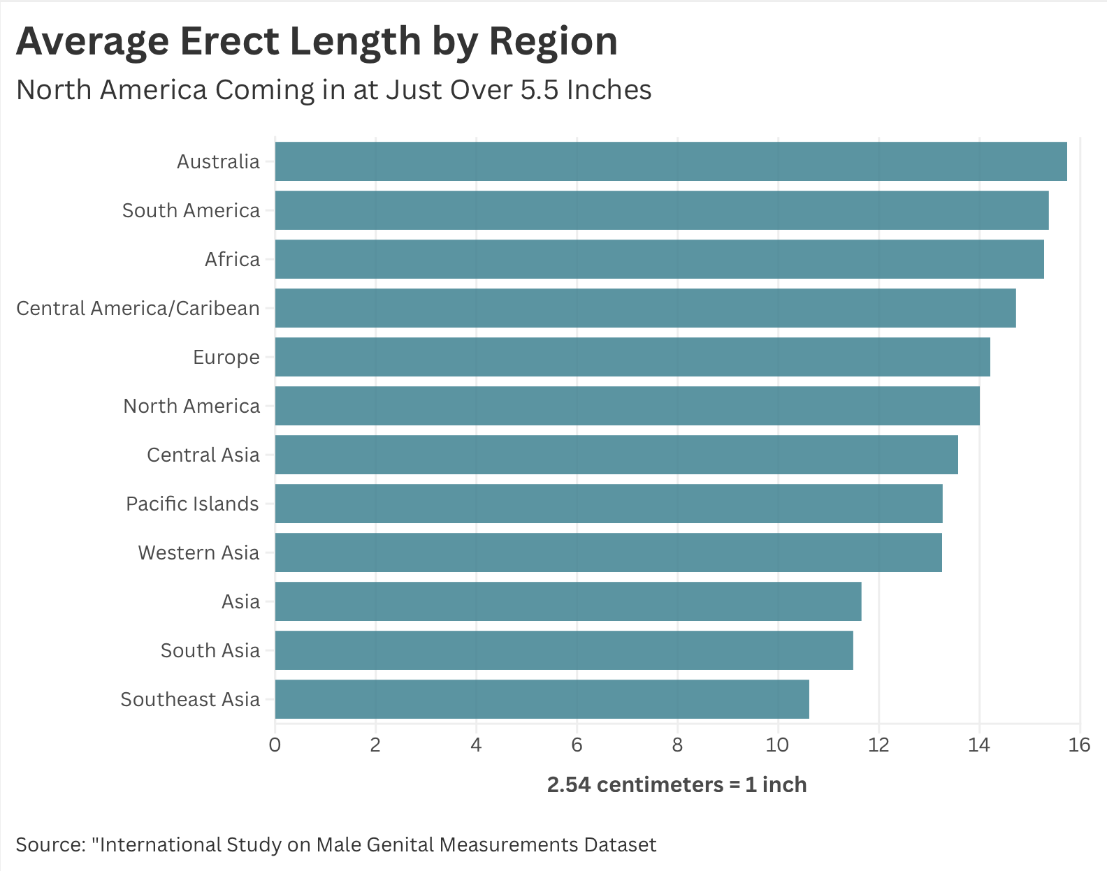
The original data had measurements in centimeters, so I included a note along the X-axis, a conversion of centimeters to inches. Feedback from the class was that I should make that conversion for my audience so they didn’t have to think so hard.
While several South American countries begin with flaccid measurements below the global average, the region undergoes a dramatic transformation. By the erect stage, these same countries skyrocket past the global baseline, officially earning South America the title of the world’s most significant ‘Grower’ region.
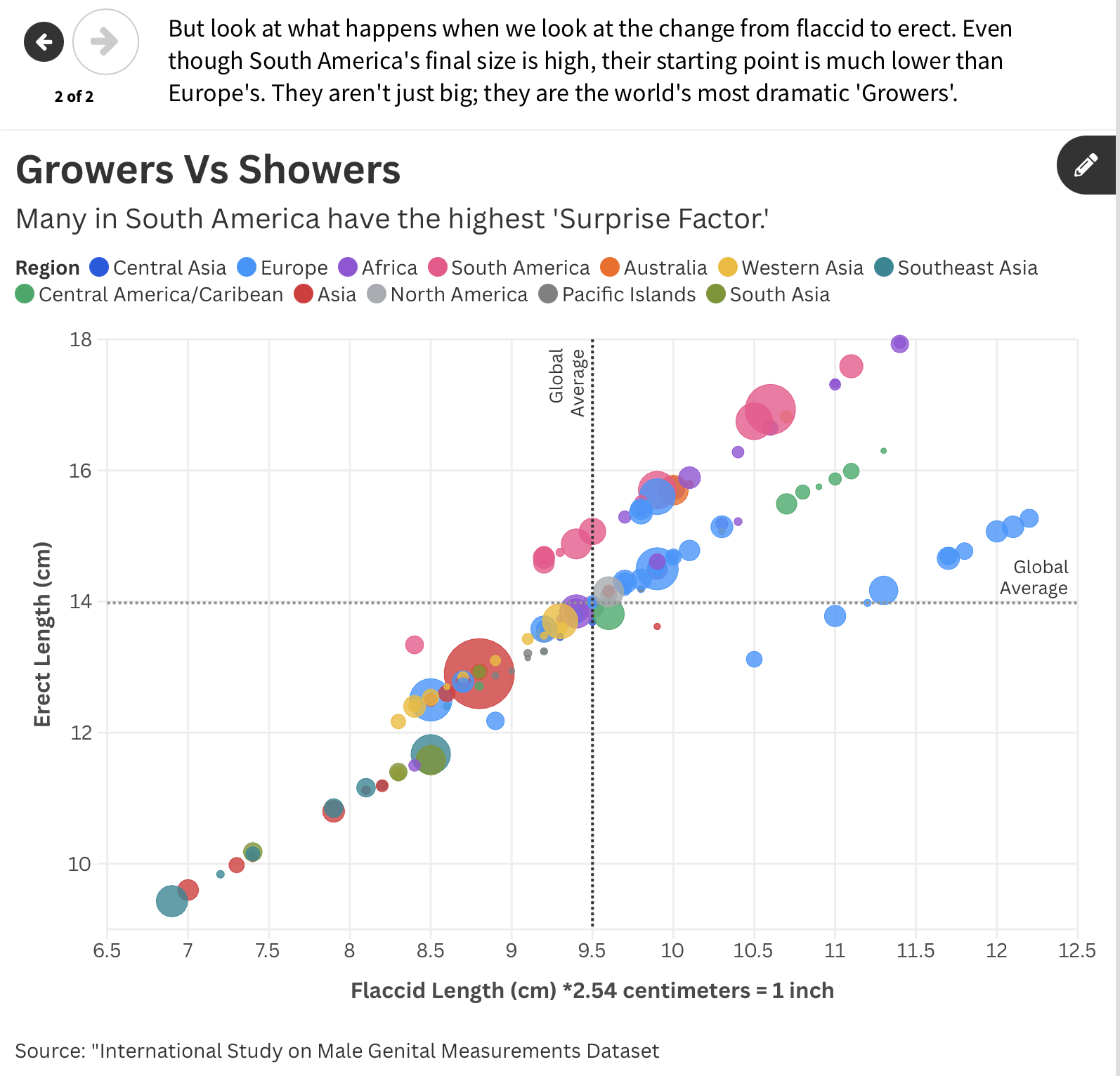
The Moral of the Story: Comparison is the thief of joy—especially when the numbers are self-reported. But as the data from South America reminds us, it’s not the size of the boat at the dock, but the motion in the ocean that defines the journey. In this dataset, ‘growth’ is the ultimate equalizer.
